

Match Your Best Place!
Timeline
My role
Deliverable
Platform
Feb 2022
Product Designer
Responsive website
Adobe XD

Do you know which place suits you best?
There are moments when you must move from your comfy home to a new location for a variety of reasons. Do you feel lonely and concerned about your future living situation? How do you get to your new school or office? What will you eat at the end of the day before returning home? What about crime and safety in your neighborhood?
Don't be concerned! Let's look for the best place where you can put your trust and live a better life. :)
URSAI is a website that assists users in finding apartments by utilizing the User-Centric Design concept. Users will be asked questions about themselves, and we will analyze their responses to recommend suite apartments to them.

01
Take our quiz
Answer the question about yourself and your preferences.
02
Choose the location
Choose the apartment in the location where you want to live.
03
Schedule a tour
Check out the apartment details and book a tour to see your future place!
Understanding the user
Available rental apartment websites can be time-consuming for users who are unfamiliar with their new surroundings, and the announcement on a website often lacks some details that are inconvenient for users to inquire about.
According to this reason, The goal of this project is to design a rental apartment website to save users time while providing them with enough information to make a decision.
Research
interview
task analysis
create personas
user journey maps
Ideation &
Starting Design
sitemap
wireframes
lo-fi prototype
1st round testing
Refining
the design
visual design
interaction design
creat mockups
hi-fi prototype
Evaluation & Iteration
2nd round testing
twisting UI design
accessibility
Going forward
key takeaways
impact
next steps
User research
To identify and understand target users, I conducted the survey, interview, and created empathy maps. The vast majority of survey respondents were college students or early-career professionals aged 19 to 30. I discovered that they need to rent an apartment for a new event in their lives, such as starting a new school or working in a new location far from home.
Persona

Problem statement for the persona I created :
Brenda is a busy PhD student who doesn’t have a car and needs fast and easy access to find an apartment close to her workplace because she must reduce travel fatigue in order to concentrate more on her PhD studies.
Brenda's user journey map

Starting the design
The inability of users to navigate a website was a major source of frustration, so I used that knowledge to create a sitemap.
My goal here was to make strategic information architecture decisions that would improve the overall navigation of the website. The structure I chose was intended to make things simple and straightforward.
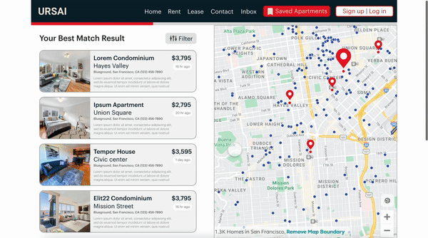
Site map

Paper wireframe
Following that, I drew paper wireframes for each screen of website pages, keeping in mind the user pain points regarding navigation, browsing, and scheduling a tour flow.
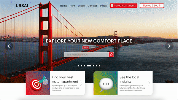
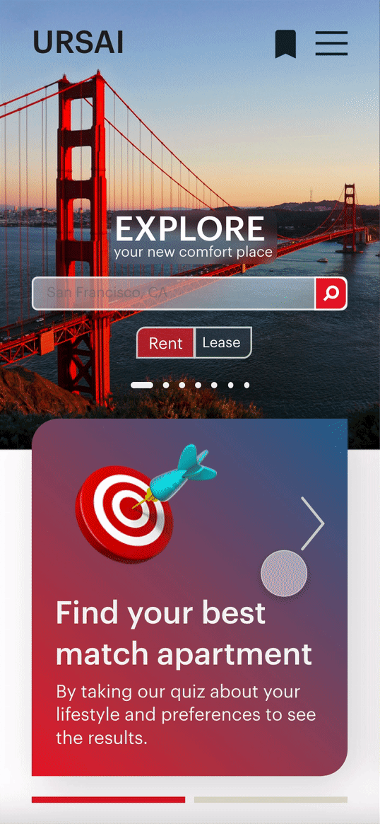
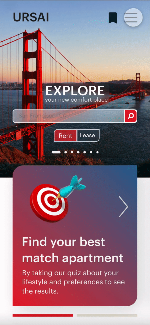
The home page displays the special features 'find best match apartment' and 'see the local insights.' to improve user experience and to save time.


Paper wireframe screen size variation
Following that, I drew paper wireframes for each screen of website pages, keeping in mind the user pain points regarding navigation, browsing, and scheduling a tour flow.
The home page displays the special features 'find best match apartment' and 'see the local insights.' to improve user experience and to save time.

Digital wireframe
From paper to digital wireframes (in low-fidelity design), I made it simple to see how the redesign could address user pain points and improve the user experience.
A key component of my strategy was prioritizing two assisting features locations and visual element placement on the home page.

The hero image is also a carousel that shows various locations
Prioritizing suggested features locations
Digital wireframe screen size variation
Moving from a desktop screen to a smaller screen size, I continue to prioritize useful features and design them with swipe buttons so that users could easily use them.

Change the layout for scrolling
The hero image is also a carousel that shows various locations
Prioritizing suggested features locations
Low-fidelity prototype
I created a low-fidelity prototype using the completed set of digital wireframes. The primary user flow I connected was scheduling an apartment tour, so the prototype could be used in a usability study.

Usability study
I conducted the research by unmoderated usability study with 5 participants that will last 25 - 30 minutes per person. They ranged in age from 19 to 30 and were either college students or early-career professionals. They've rented an apartment through the website before. I tested them with a Lo-Fi prototype on Adobe XD.

What about their feedback?
1. Navigation: Participants prefer to have a navigation bar that indicates how far they have progressed in the quiz or how many steps remain.
2. Menu bar: The menu bar in our 1 st wireframe was unfamiliar to the participants. They can't find a button and claim it's difficult to use.
3. Inbox: Users want to communicate with the owner more easily, such as through a chatbox where they can text messages to the owner.
4. Saved apartment: The saved apartment button should be relocated so that it is more visible and easy to use.
Refining the design
Visual Design


Mockup
I made changes to the menu bar based on the findings of the usability study. I improved the navigation by adding more details and making it more useful. This allowed users more freedom to navigate on the website.
before usability study

after usability study

In addition, I added a navigation bar that shows how far users have progressed and redesigned the 'saved apartment' button to make it easier to use. I converted the 'contact owner button' next to the schedule a tour box into a chat box that links to the 'Inbox' session on the menu bar.
before usability study

after usability study

Interaction Design
Based on my previous wireframes, I included considerations for additional screen sizes in my mockups. Because our product is used on a variety of devices, I felt it was critical to optimize the browsing experience for a variety of device sizes, such as mobile and tablet, to ensure users have the best possible experience.
I included some interaction within the smaller screen size, such as a mobile, so that users could interact with the product within the limited screen area.

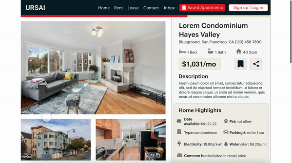
High-fidelity prototype
This high-fidelity prototype followed the same user flow as my low-fidelity prototype and incorporated design changes made following the usability study.
on website

on mobile

tap anywhere to interact
with the prototype
Accessibility considerations
1. Icons and detailed - The imagery was used to make navigation easier and to assist users who are not fluent in English in understanding.
2. Contrast ratio - I used a contrast ratio that is above 3:1, which also corrects the visual hierarchy in texts and buttons.
3. Visual hierarchy - I used headings with different text sizes to create a clear visual hierarchy.
Reflection
Impact
Our target users commented that the design was easy to navigate, that the images were more engaging, and that there was a clear visual hierarchy. One participant said that
"The matching apartment feature has the potential to save me a lot of time and improve my quality of life. I would feel more at ease and secure if I lived in a location that suited me."
What I learned
1. Tools: First and foremost, this is my first time using Adobe XD. I learned to use new tools to improve my work and skills, even though I was already familiar with Figma.
2. User needs: It has been discovered that even minor design changes can have a significant impact on user experience. Usability studies and peer feedback influenced the design of the app at each iteration. The most important takeaway I received was to always focus on the user's actual needs.
3. Time management: Because there are only 6 weeks to complete this project, planning is critical to completing it on time. I had to make a quick decision to select the task and not be afraid to devote all of my time and energy to the entry project. However, I believe it is worth the effort! :)